
Open your website on a phone and try to do the one thing you want customers to do: call, book, buy or send an enquiry. If you have to pinch, zoom, scroll sideways or hunt for a button, the site is not responsive enough, however good it looks on a laptop.
This guide explains how to design responsive websites step by step: planning mobile-first, setting up the viewport, building fluid grids, choosing breakpoints, handling images and type, keeping Core Web Vitals healthy and testing properly. We have added practical notes for WordPress and Elementor, since that is what most of our clients’ sites run on.
Key takeaways
- Responsive web design means one website, one URL and one set of HTML that adapts its layout to every screen size. Google recommends it as the easiest mobile configuration to build and maintain.
- Google uses the mobile version of your pages for indexing and ranking, so your mobile layout must carry the same content, headings, images and structured data as desktop.
- Design mobile-first, then add breakpoints only where the content starts to look wrong. Don’t build around specific phone models.
- Use flexible layouts (CSS grid and flexbox), images with
max-width: 100%plus width and height attributes, and responsive images withsrcsetandsizes.- Aim for good Core Web Vitals: LCP within 2.5 seconds, INP of 200 milliseconds or less and CLS of 0.1 or less, measured at the 75th percentile.
- Test on real phones as well as browser tools, especially forms, menus and anything you tap.
What responsive website design actually means
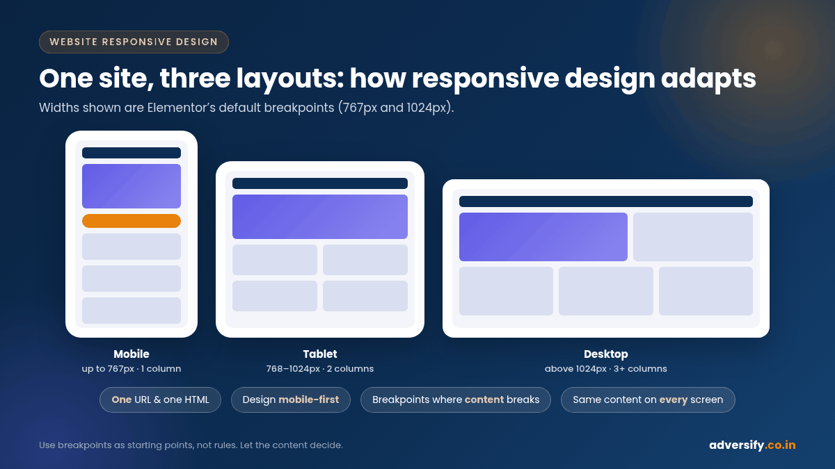
Website responsive design is an approach where the layout changes to suit the device being used. A responsive page might show one column on a phone, two on a tablet and three or four on a desktop, without serving a different site or URL. The idea was first described by Ethan Marcotte, and web.dev’s guide to responsive web design basics remains one of the clearest references.
There are three ways to make a site work on mobile: responsive design, dynamic serving (same URL, different HTML per device) and separate mobile URLs (the old “m-dot” sites). Google recommends responsive design because it is the easiest pattern to implement and maintain (Google Search Central: Mobile-first indexing best practices).
Why it matters for SEO and enquiries
Google uses the mobile version of a site’s content, crawled with a smartphone agent, for indexing and ranking. If your mobile layout hides text, drops images or loses headings, Google sees less of your page. With responsive design the content and metadata are the same on both versions, which removes a whole category of problems.
The business case is even simpler. Check the device report in Google Analytics: for many local and service businesses, phones bring the larger share of visitors, and those visitors decide quickly whether to stay. A responsive, fast page keeps them long enough to call.
Step 1: Plan the content mobile-first
Mobile-first doesn’t mean “design the phone version last and squash everything”. It means designing the smallest screen first, deciding what truly matters, and then adding space and detail as the screen grows.
- List the page’s job. One main action per page: call, WhatsApp, book, buy or enquire.
- Order the content by importance. On a phone, everything is stacked. Put the headline, the key benefit and the main button first; push long text and secondary links lower.
- Sketch the phone layout first. Then sketch tablet and desktop versions and note where extra columns help.
- Don’t remove content for mobile. web.dev advises against hiding content just because it doesn’t fit, and Google indexes the mobile version. Use accordions or tabs instead of deleting sections.
Step 2: Set the viewport meta tag
Every responsive page needs this line in the <head>:
<meta name="viewport" content="width=device-width, initial-scale=1">
Without it, mobile browsers render the page at a desktop width (web.dev notes this is usually around 980px) and shrink it down, which makes text tiny. width=device-width tells the browser to match the screen width, and initial-scale=1 keeps a 1:1 scale when the phone is rotated. MDN’s viewport meta reference covers the other values. Most modern WordPress themes add this tag for you; check your page source to confirm.
Step 3: Build fluid grids with flexbox and CSS grid
Fixed pixel widths are the most common reason a page scrolls sideways on a phone. Modern CSS gives you better tools:
- Flexbox for rows of items that should wrap onto new lines as space runs out, such as service cards or logos.
- CSS grid for two-dimensional layouts. A single rule such as
grid-template-columns: repeat(auto-fit, minmax(240px, 1fr))creates as many columns as fit, without any media query. - Relative units (%,
fr,rem,vw) rather than fixed pixels for widths, gaps and padding. - A sensible maximum width for text blocks, so lines don’t stretch across a wide monitor.
MDN’s responsive design module has worked examples of each technique if you or your developer want to go deeper.
Step 4: Choose breakpoints based on content, not devices
A breakpoint is the screen width at which your layout changes, written as a CSS media query such as @media (min-width: 768px). web.dev’s advice is to avoid breakpoints based on device classes or brand names. Start with the small layout, widen the browser until the design starts to look wrong, and add a breakpoint there.
That said, most teams use a few common starting points, and page builders come with defaults. The table below is a practical reference, not a rule:
| Screen range (CSS pixels) | Typical devices | Common layout | Things to check |
|---|---|---|---|
| Up to about 480px | Most phones in portrait | Single column, stacked cards, sticky call or WhatsApp button | Tap targets, form fields, menu, font size |
| About 481px to 767px | Large phones, phones in landscape | Single column or two small columns | Images not too tall, tables scroll inside their box |
| About 768px to 1024px | Tablets, small laptops | Two columns, condensed navigation | Navigation switching point, sidebars |
| Above 1024px | Laptops and desktops | Three or four columns, full menu | Line length, very wide screens, white space |
If you use Elementor, its default breakpoints are 767px for mobile and 1024px for tablet, and you can change them or add more under Site Settings, Layout, Breakpoints (Elementor: Responsive editing for mobile and tablets). Elementor’s responsive editing is top-down: a change made on desktop flows down to tablet and mobile unless you override it on the smaller device.
Step 5: Make text readable at every size
- Body text: start around 16px on mobile. Anything smaller tends to get zoomed.
- Line length: web.dev cites classic readability guidance of about 70 to 80 characters per line (8 to 10 words in English). Limit the width of text blocks on large screens.
- Fluid headings: CSS
clamp()lets a heading grow smoothly between a minimum and maximum size, for examplefont-size: clamp(1.75rem, 4vw, 3rem), instead of jumping at breakpoints. - Contrast: light grey text on white looks elegant on a designer’s monitor and disappears on a phone in sunlight.
Step 6: Handle images and media properly
Images are usually the heaviest part of a page and the most common cause of layout problems.
- Stop overflow. web.dev recommends giving images
max-width: 100%so they shrink to fit their container. - Always set width and height attributes. This lets the browser reserve space before the image loads and prevents content jumping around, which helps your CLS score.
- Serve the right size. Use
srcsetandsizesso phones download a small file and large screens get a sharper one. MDN’s guide to responsive images explains both, plus the<picture>element for art direction. WordPress generatessrcsetautomatically for images added through the media library. - Use modern formats. WebP or AVIF are usually much smaller than JPEG or PNG at similar quality.
- Lazy-load below-the-fold images only. Don’t lazy-load your main hero image; it is often the page’s Largest Contentful Paint element.
- Make embeds responsive. Videos and maps need a wrapper with a fixed aspect ratio (CSS
aspect-ratio: 16 / 9) so they scale with the screen.
Step 7: Design navigation, buttons and forms for thumbs
On a phone, people tap with a thumb, often with one hand. A layout that works with a mouse can fail completely on touch.
- Tap targets: WCAG 2.2 sets a minimum target size of 24 by 24 CSS pixels, with exceptions (W3C: Understanding Target Size (Minimum)). For main buttons, go well above the minimum and leave space between links.
- Menus: keep the mobile menu short. Five to seven top-level items is plenty; put the call button outside the menu.
- Sticky actions: a slim sticky bar with Call and WhatsApp works well for local service businesses, as long as it doesn’t cover content.
- Forms: ask only for what you need, use the correct input types (
type="tel"brings up the number keypad,type="email"the email keyboard) and keep labels visible above fields. - Hover effects: touch screens have no hover. Never hide important information behind a hover state.
- Tables: wide comparison tables should scroll horizontally inside their own container rather than breaking the page.
Step 8: Keep Core Web Vitals in the green
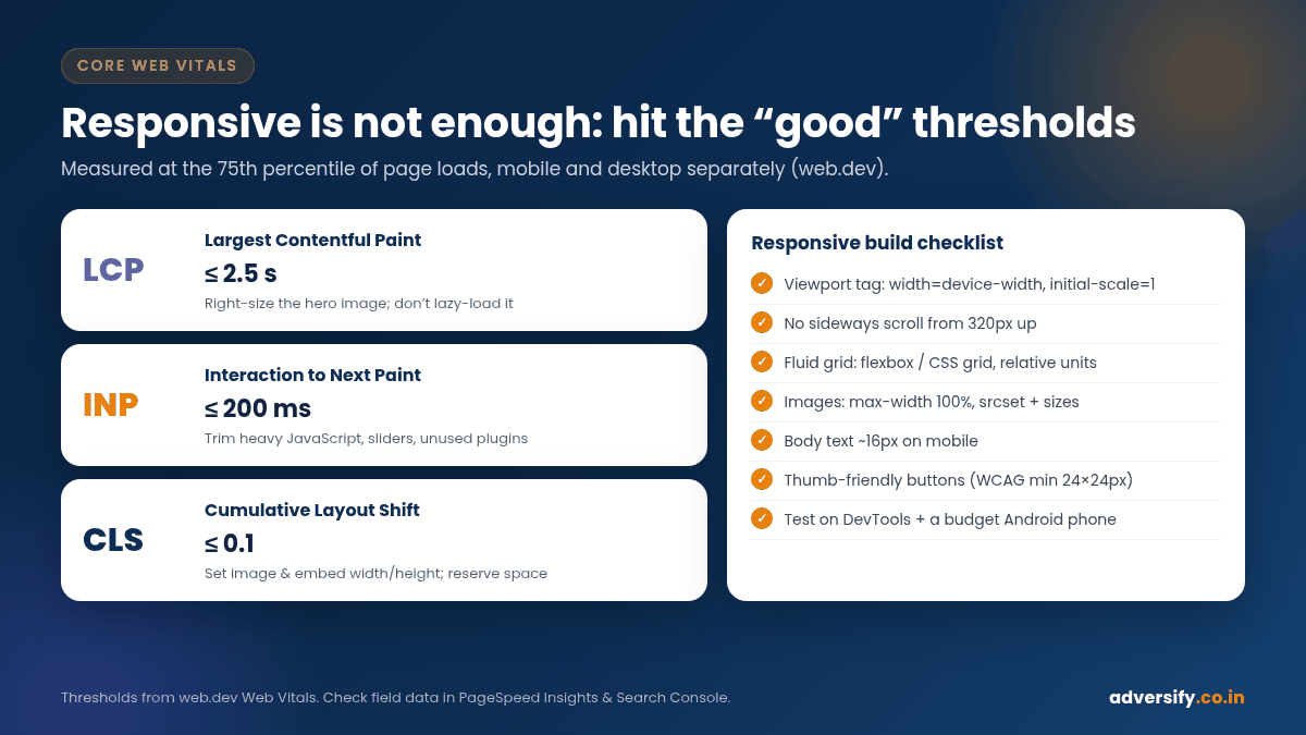
A responsive layout that loads slowly is still a poor mobile experience. Google’s Core Web Vitals measure three things (web.dev: Web Vitals):
| Metric | What it measures | “Good” threshold | Common responsive-design fixes |
|---|---|---|---|
| Largest Contentful Paint (LCP) | Loading: when the main content appears | Within 2.5 seconds | Compress and correctly size the hero image, don’t lazy-load it, reduce render-blocking CSS and scripts, use good hosting and caching |
| Interaction to Next Paint (INP) | Responsiveness to taps and clicks | 200 milliseconds or less | Cut heavy JavaScript, sliders and unused plugins; load third-party scripts carefully |
| Cumulative Layout Shift (CLS) | Visual stability while loading | 0.1 or less | Set image and embed dimensions, reserve space for banners and ads, avoid fonts that cause big reflows |
Google suggests checking these at the 75th percentile of page loads, separately for mobile and desktop. You can see field data for your own site in PageSpeed Insights and in the Core Web Vitals report in Search Console. web.dev’s guides to optimising LCP and optimising CLS go into detail.
Step 9: Test like a customer, not a designer
- Browser device mode. Chrome DevTools’ device mode lets you preview any width and shows your media query breakpoints as coloured bars (Chrome DevTools: Device mode). Drag the width slowly from small to large and watch for anything that breaks between breakpoints.
- Real phones. Test on at least one budget Android phone as well as your own handset. Pages that feel fast on a new iPhone can feel slow on an entry-level device on mobile data.
- Real tasks. Fill in the form, tap the call button, open the menu, scroll a table, play a video.
- Performance. Run the page through PageSpeed Insights and fix the biggest items first.
- Search Console. After launch, watch the Core Web Vitals report and use URL Inspection to see how Google renders key pages.
WordPress and Elementor tips for responsive sites
- Start from a lightweight theme. A heavy multipurpose theme with sliders and animations on every section makes good mobile performance much harder.
- Use containers with flexbox or grid. Elementor’s container layouts map closely to flexbox and grid, which behave better across screen sizes than old nested sections and columns.
- Set responsive values, don’t duplicate sections. Building separate “mobile-only” and “desktop-only” copies of a section doubles your content in the HTML and makes updates error-prone. Adjust font sizes, padding and column direction per device instead.
- Use global fonts and colours. Set typography once in Site Settings so headings scale consistently instead of being styled widget by widget.
- Watch plugins. Every plugin that adds front-end scripts can hurt INP. Remove what you don’t use.
- Keep everything updated. Theme, plugin and core updates can break layouts. A regular website maintenance routine catches issues before customers do.
Quick responsive design checklist
| Check | Pass looks like |
|---|---|
| Viewport tag | width=device-width, initial-scale=1 present in the page head |
| No sideways scroll | No horizontal scrollbar at 320px width and above |
| Same content on mobile and desktop | Headings, text, images, alt text and structured data match |
| Readable text | Body text around 16px on mobile, comfortable line length on desktop |
| Images | Correct dimensions set, srcset used, hero not lazy-loaded |
| Tap targets | Buttons easy to tap with a thumb, links not crammed together |
| Forms | Short, correct input types, labels visible, tested on a phone |
| Core Web Vitals | LCP ≤ 2.5s, INP ≤ 200ms, CLS ≤ 0.1 in field data |
Common responsive design mistakes
- Designing on a 27-inch monitor and checking mobile only at the end.
- Using fixed pixel widths for containers, images or tables.
- Hiding content on mobile to “make it fit”, which also hides it from Google’s mobile-first indexing.
- Huge hero sliders that push the headline and button below the fold on phones.
- Pop-ups that cover the whole screen on mobile as soon as the page loads.
- Testing only on the latest flagship phone and fast office Wi-Fi.
Frequently asked questions
What is the difference between responsive and adaptive design?
Responsive design uses fluid layouts and media queries so one layout flexes to any width. Adaptive design usually means building a few fixed layouts for set screen sizes and switching between them. Responsive is simpler to maintain and is what Google recommends for mobile sites.
Is mobile-first the same as responsive?
Not quite. Responsive describes the result: a site that adapts to any screen. Mobile-first describes the process: design for the smallest screen first, then enhance for larger ones. Most good responsive sites are built mobile-first.
How many breakpoints does a website need?
As few as the content needs. Many sites work well with two or three major breakpoints plus small tweaks. Add one only when the layout genuinely starts to look wrong.
Can I make my existing WordPress site responsive without a redesign?
Often, yes. Fixing the viewport, fixed widths, image sizes, menus and forms can make a big difference. If the theme itself is not responsive or is very heavy, a rebuild is usually cheaper in the long run than patching it.
Does responsive design improve Google rankings?
It helps Google see the same content on mobile as on desktop, and it supports a better page experience, but it doesn’t guarantee higher rankings on its own. Content, relevance and links still matter most.
How do I test my website on different screen sizes for free?
Use Chrome DevTools’ device mode, PageSpeed Insights and your own phones. Ask a few friends with different handsets to complete a real task on your site.
Need a site that works on every screen?
If your site looks fine on desktop but struggles on phones, we can help. Our web design and development team builds responsive, SEO-ready WordPress sites from our offices in Noida and Hauz Khas, New Delhi, and our Delhi web design clients get the same mobile-first process. Request a free website and SEO audit and we will show you exactly what is slowing your mobile visitors down.
3 Responses